Icon design

As the Early Access release will happen in the near future, we need to add several things to our Steam page. One of these things is naturally icon graphics. At first they might not seem like a big deal but they are actually hugely important. It took some time to figure out and make the best designs we could.
The most difficult icons are the small ones. You should be able to raise interest with them but you have very limited space to do that. Keeping it simple and showing only the most important thing from your game might be the most obvious solution. That's easy as long as you can define the most important features in your game :)
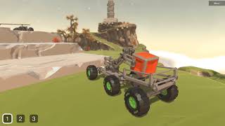
We thought we should show the following things somehow: The game is space themed and you can build your own vehicles from the scratch. The space theme was implemented just by adding a starry background to the icon. The free building mode was more difficult as rover structures became easily unclear when scaled down. We ended up showing only the front of one vehicle in the smallest steam icon. Hopefully it's enough to show that the rover is not just a premade model. And of course big wheels were included to hint at the driving. You can build walking robots and many more things too, but we still felt the wheel is the obvious part to show. Luckily the name of the game helps us a lot too...
Here are some designs we made. Feel free to comment and give feedback about these!